Coupon Experience Redesign
Making savings clear, actionable, and trustworthy
Redesigned the coupon experience to eliminate ambiguity, improve usability, and increase customer confidence in savings.
What Was Done
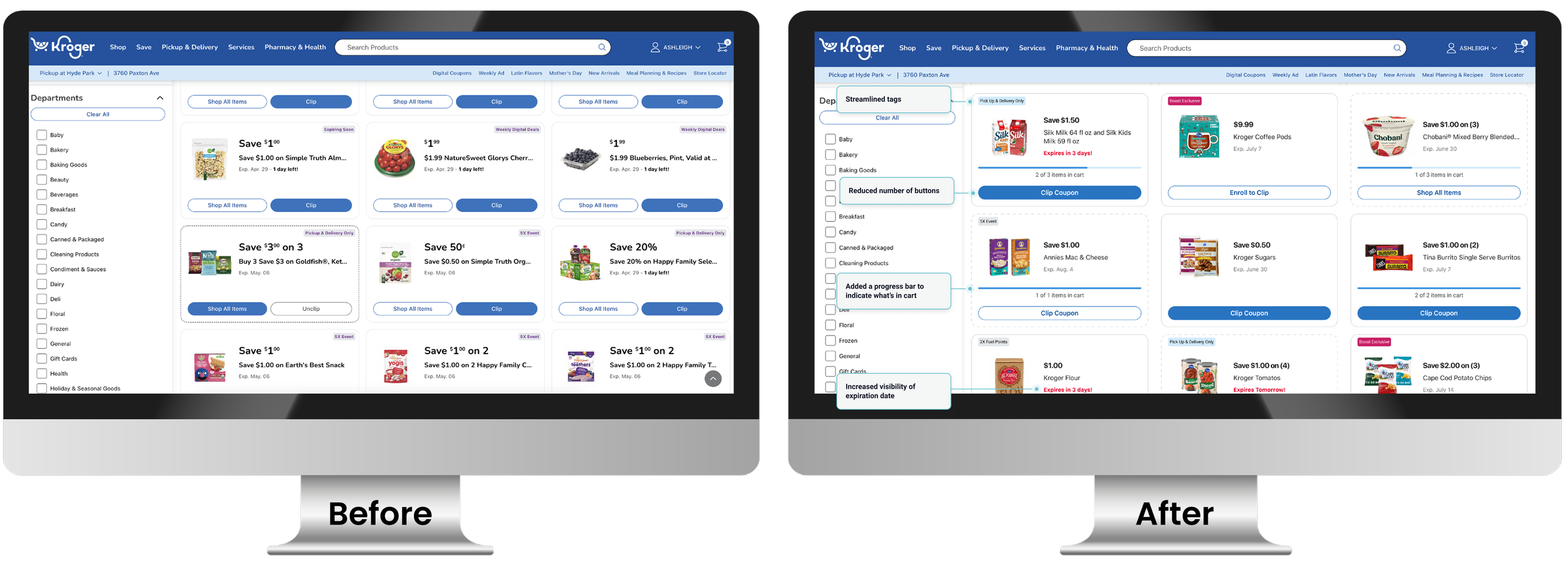
Eliminated “clip & hope” confusion
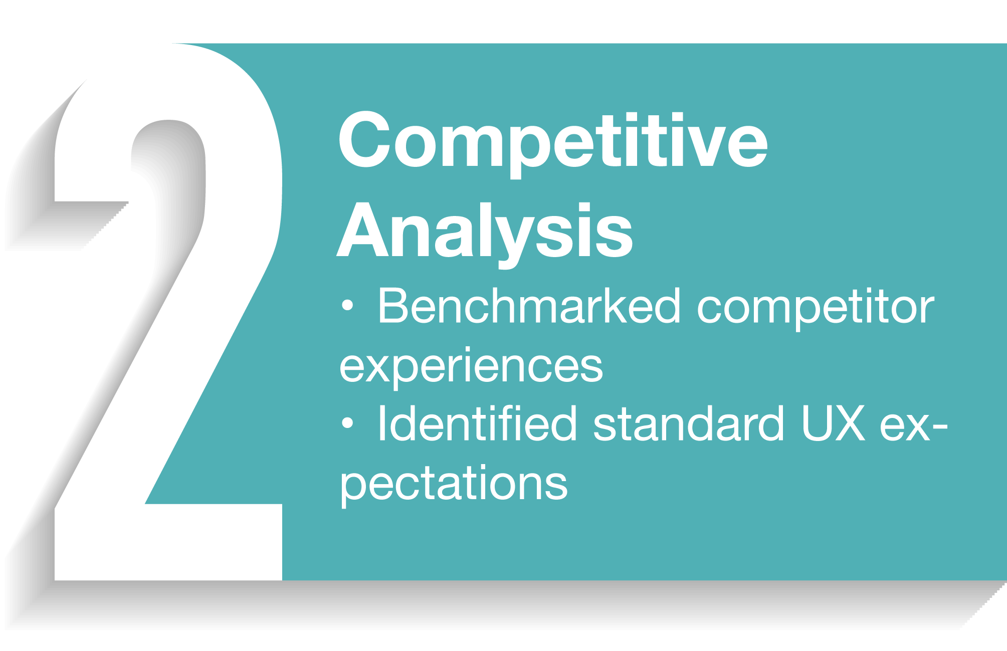
Improved clarity of coupon states
Streamlined path to redemption
Projected increase in engagement
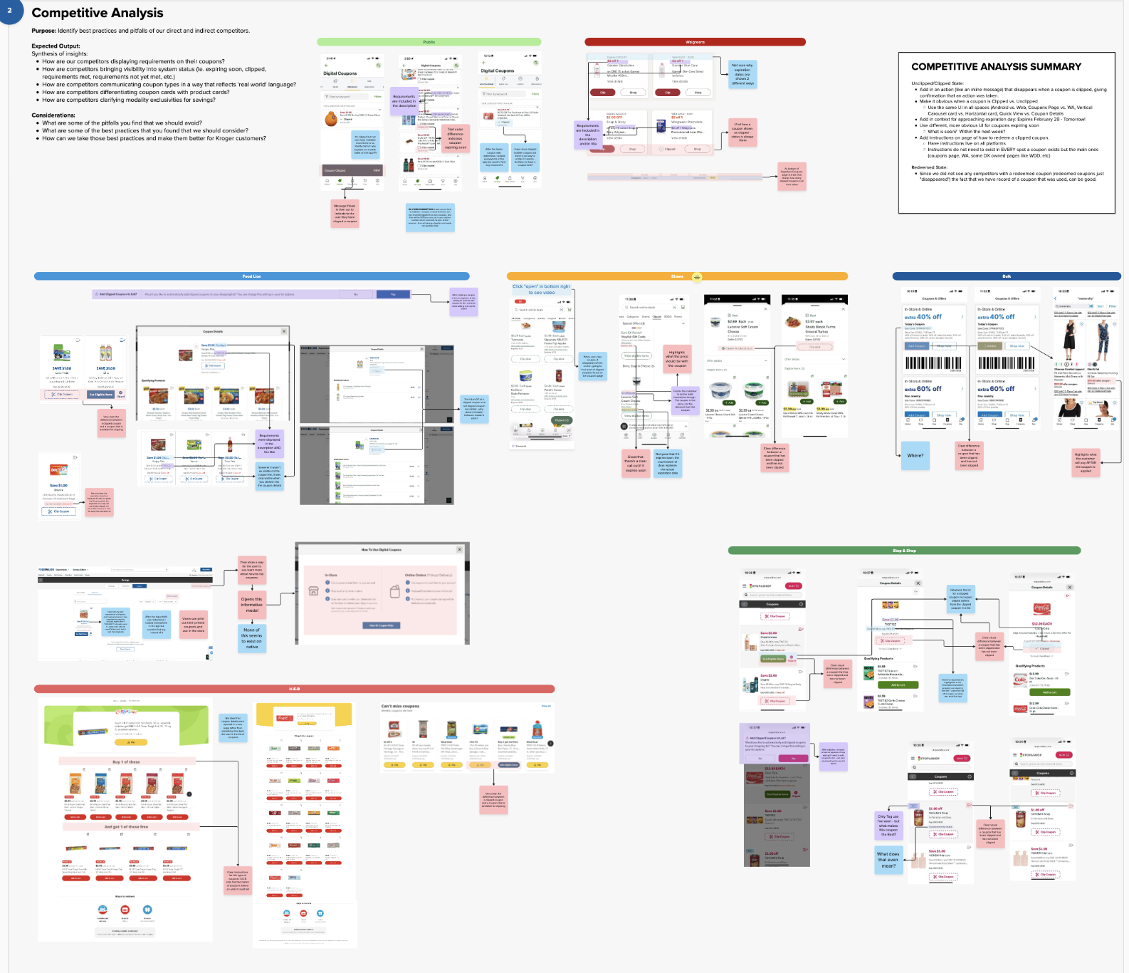
The Problem
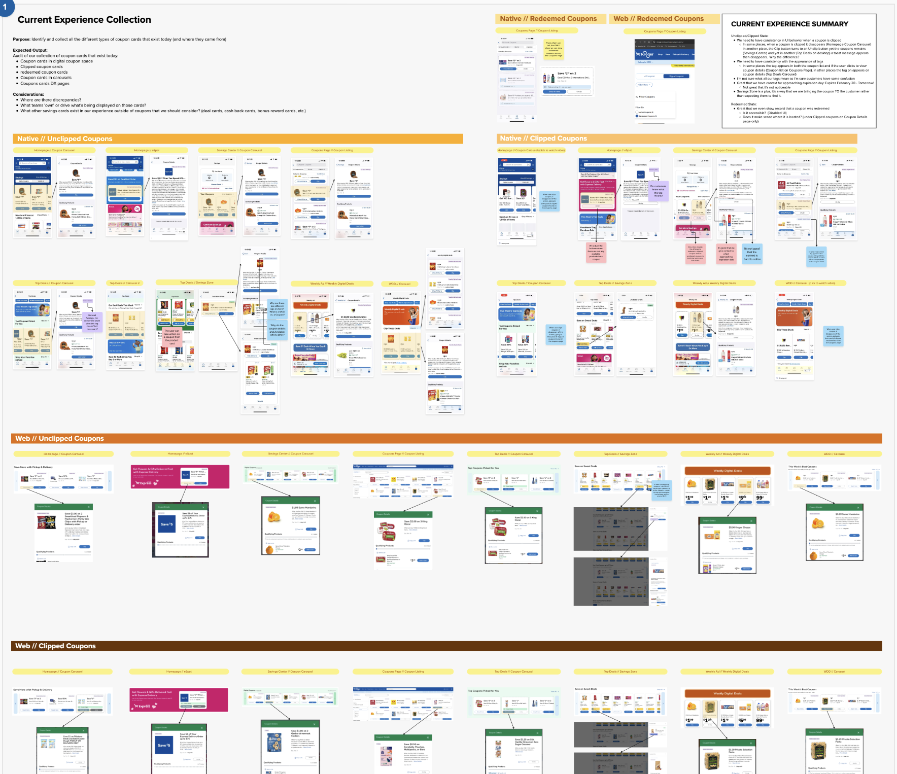
Over time, recurring themes began surfacing across both coupon-specific and broader savings research initiatives. Through surveys, customer interviews, usability studies, and behavioral insights, we consistently heard the same frustrations:
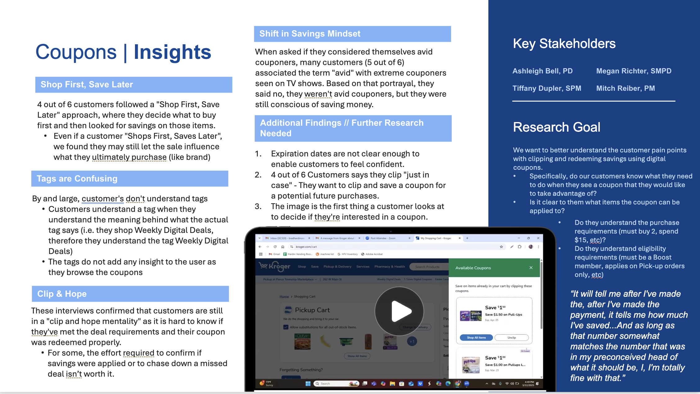
Customers were unsure if a coupon was successfully clipped
Users didn’t clearly understand what actions were required to redeem offers
Expiration timing often went unnoticed until it was too late
These pain points appeared repeatedly across multiple research efforts, signaling that the issue wasn’t isolated to a single feature—it reflected a broader gap in clarity and confidence within the savings experience.
This ultimately led to a “clip and hope” behavior, where users lacked trust that savings would actually be applied.
Unclear Status
When a coupon is clipped, it disappears, so all coupons on page appear to be unclipped and user may think they haven’t clipped any.
No Next Step
Is the right coupon clipped? Do I have items in my cart?
Hidden Expiration Date
My Approach
Design Principles
☁️ Clarity over ambiguity
Users instantly understand coupon status
🔎 Guided action
Clear next steps after clipping
⏰ Timely urgency
Expiration is obvious and actionable
Key Design Decisions
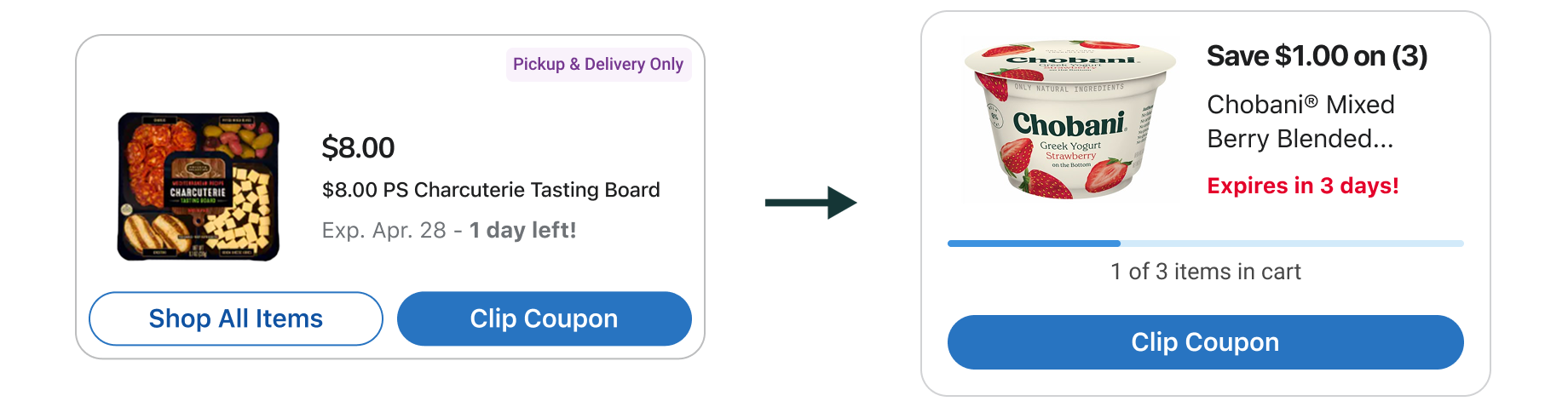
Simplified Interaction Model
Reduced buttons and steps
Streamlined clip → redeem flow
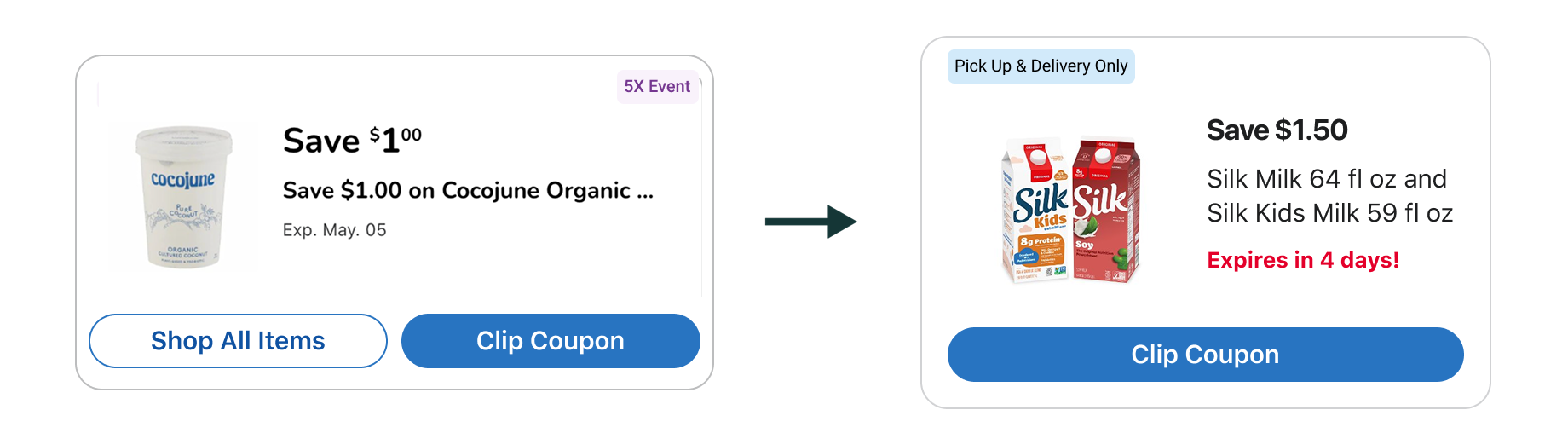
Clarified Action Needed
Standardized states: Available / Clipped
Removed ambiguity
Introduced progress bar to track items needed for deal completion
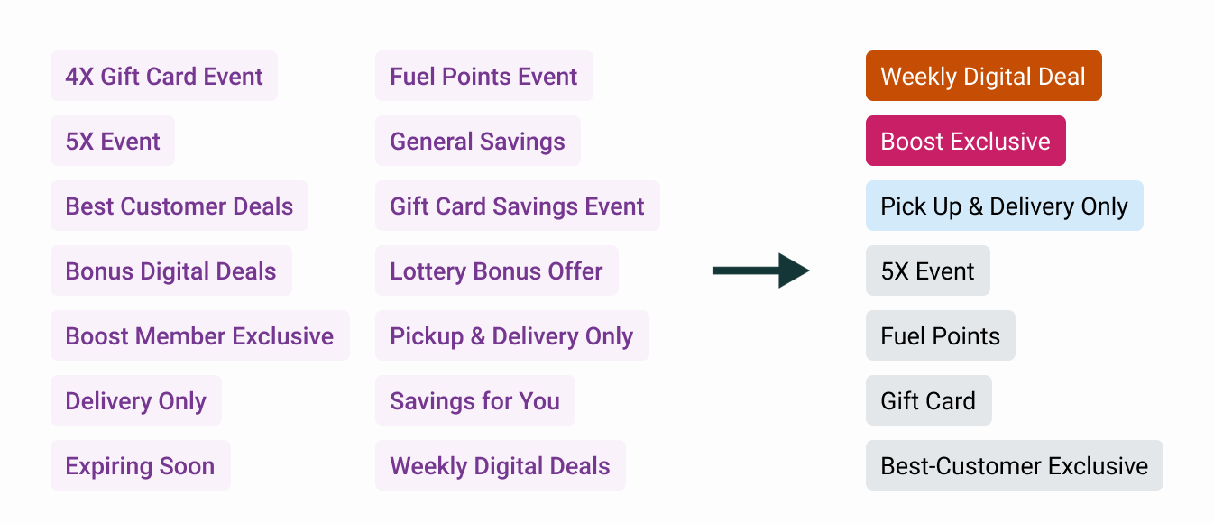
Reworked Tagging System
Aligned with broader product taxonomy
Improved recognition and consistency
Improved Contextual Expiration Date
Changed color of “Expires tomorrow”
Increased urgency + clarity
Cross-Functional Leadership
Product → strategy alignment ⦿ Engineering → feasibility + implementation ⦿ Research → validation ⦿ Design → consistency + polish
A number of tradeoff discussions had to be facilitated across Product, Engineering, and Research to align customer needs with technical feasibility and future product vision.
We used customer research to identify which pain points required immediate solutions versus opportunities that could be addressed through future iterations, ensuring the MVP delivered meaningful value while remaining scalable long term.
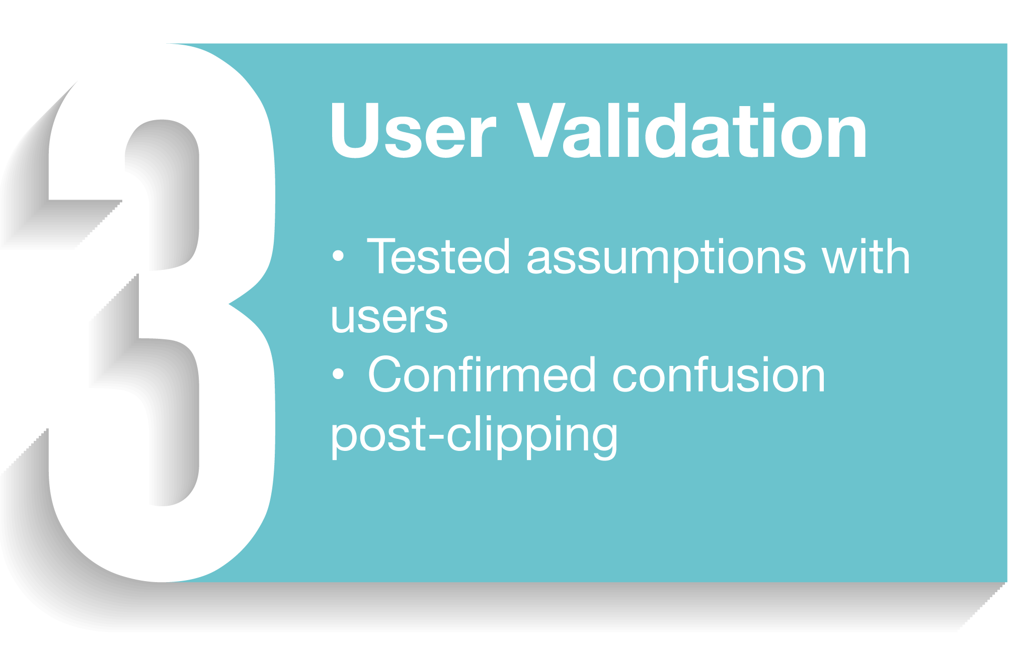
What We Tested
Clarity of coupon status
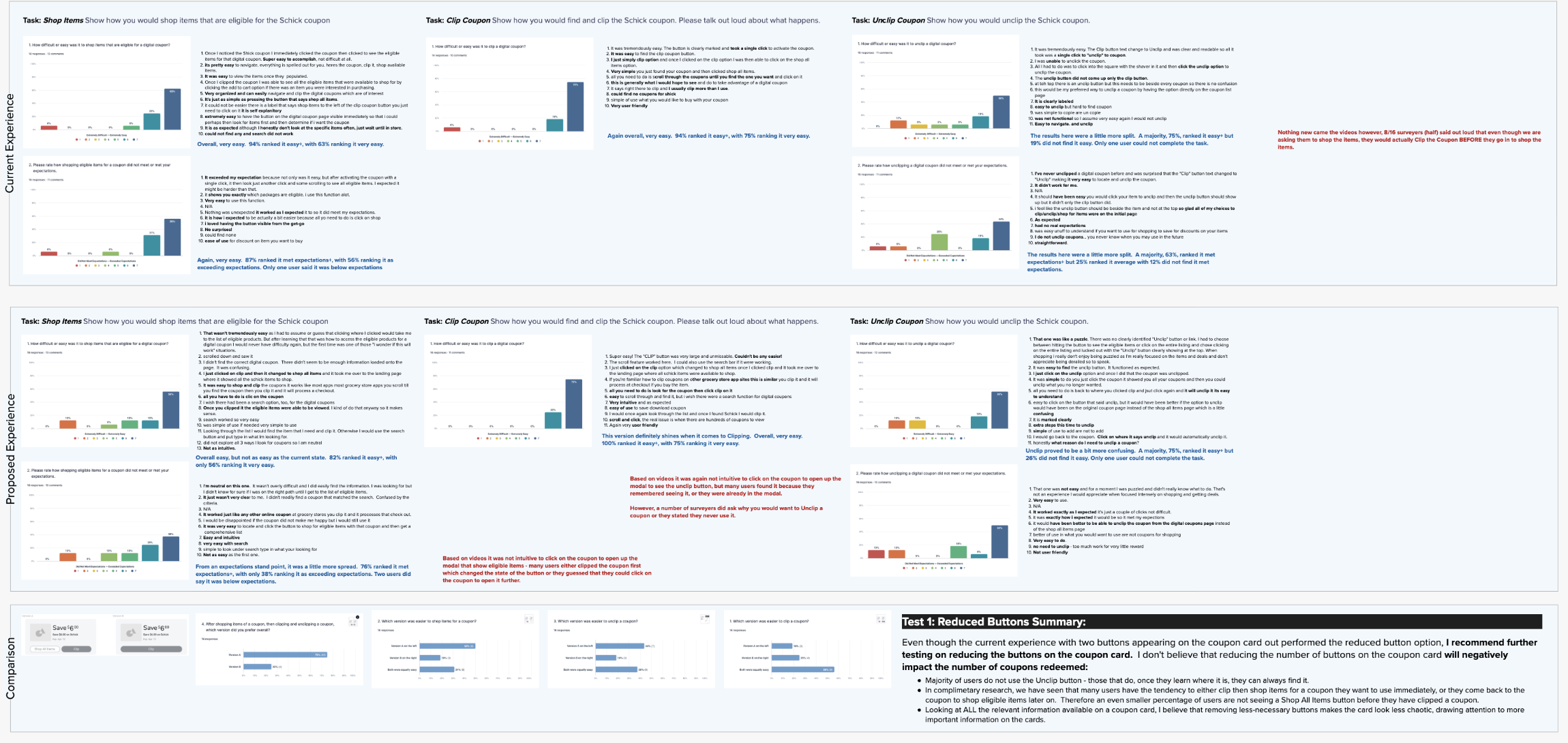
Understanding of Requirements
Confidence in Redemption
Outcome
Due to broader company reprioritization, the final product ultimately did not ship. However, the work was extensively validated through user testing, research insights, and stakeholder alignment, reinforcing the value of the proposed direction.
More importantly, many of the learnings from this initiative continued to influence product decisions well beyond the original scope of coupons. Over a year later, findings around clarity, status communication, urgency, and user guidance are still informing design patterns and product card experiences across the broader Kroger ecosystem.
Key improvements:
Clearer coupon states
Reduced post-clip confusion
Stronger foundation for scalable design
Projected impact:
Increased engagement and redemption
Improved user confidence
Reduced support friction
Key Takeaways
Clarity builds trust in transactional UX
Small changes can drive meaningful behavior shifts
Systems thinking enables long-term scalability
Final Reflections
This project reinforced the importance of designing for confidence, not just functionality. By removing ambiguity and guiding users clearly, even a simple feature like coupons can become a more trusted and effective part of the experience.