
Ad Selector
Helping customers discover the right Weekly Ad experience
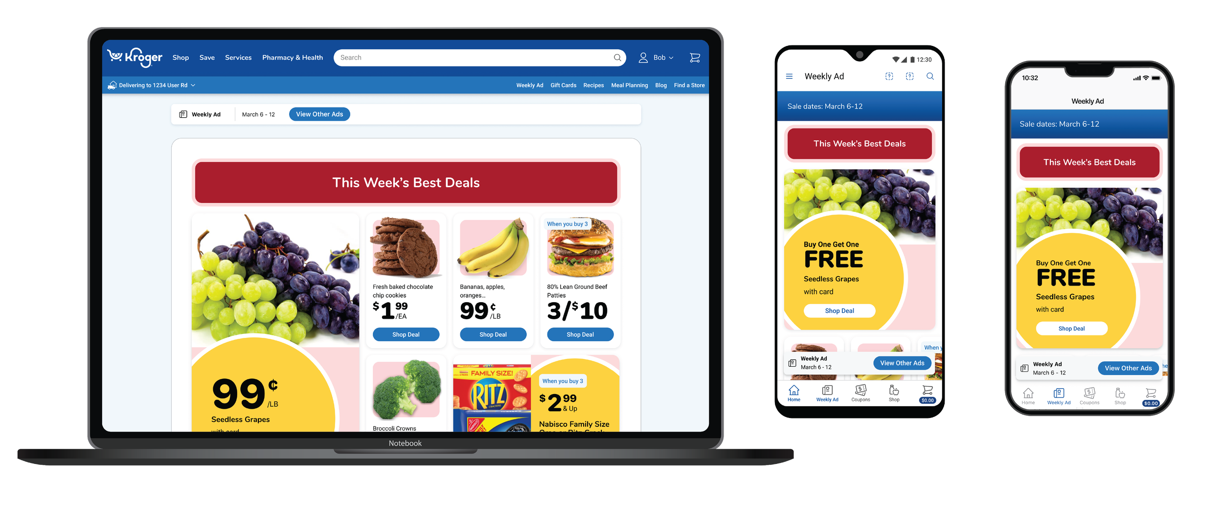
Impact Metrics
34% engagement
with Ad Selector
10% increase
in Add-to-Carts
Supported
4 platforms
Accommodated up to
8 ad experiences
The Ad Selector successfully exposed customers to additional ad experiences that were previously difficult to discover.
These findings suggest that helping customers find the most relevant ad experience increased engagement and shopping intent.
Because Weekly Ads support both digital and in-store shoppers, actual customer impact likely extends beyond measurable eCommerce activity.
The Problem
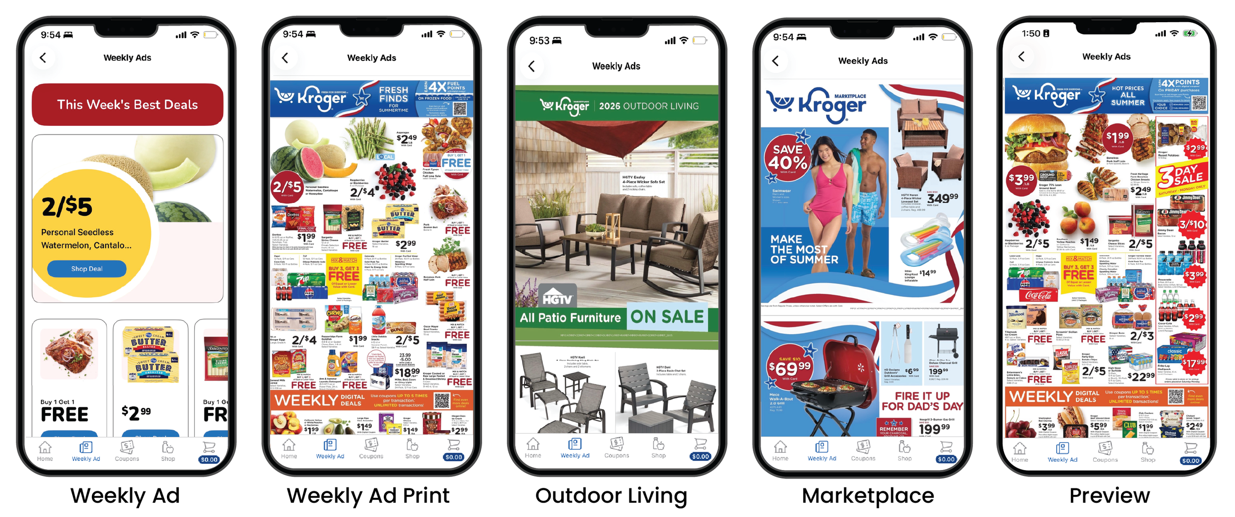
Customers can access multiple versions of the Weekly Ad experience depending on their store, market, and timing—including promotional previews, traditional print-style ads, marketplace offers, and more interactive digital ad experiences designed for eCommerce shopping.
These ad experiences weren’t just visually different—they varied in functionality. Some offered a familiar, browse-only experience, while others enabled deeper digital interactions like shopping products directly, building carts, and engaging with personalized offers.
As more digital ad experiences were introduced, customers lacked a clear, intuitive way to understand what options were available to them and which ad best fit their shopping needs
Without a scalable solution, navigating multiple ad formats risked becoming increasingly overwhelming, creating friction, limiting discoverability, and reducing engagement.
The challenge: Design a streamlined, scalable experience that helps customers quickly understand and select the ad experience most relevant to them—without interrupting their shopping journey.
Strategic Design Decisions
🤝 Aligning on the Problem
Successful discovery depends on aligning around the problem before aligning on a solution. I facilitated assumption-mapping workshops to help stakeholders distinguish validated customer needs from hypotheses and preconceived solutions. By reframing ideas as assumptions to test rather than truths to defend, we created space for evidence to guide our decisions throughout the design process. This approach kept the team focused on solving the right problem—even if it meant the original solution evolved.
🧠 Learning From Existing Mental Models
I believe competitive research is most valuable when it captures diverse perspectives, not just my own. To broaden our understanding of customer expectations, I facilitated a collaborative review where stakeholders, product managers, engineers, and designers brought examples of experiences they had encountered across industries. Together, we identified recurring interaction patterns, discussed why certain approaches felt intuitive, and used those insights to inform—not dictate—our solution. This worked because customers don't develop expectations based solely on grocery apps—they bring mental models from every digital experience they use. By drawing inspiration from products both inside and outside our industry, we uncovered familiar interaction patterns that made our eventual solution feel more intuitive.
💡Exploring the Solution Space
Rather than jumping straight into wireframes, I facilitated a collaborative sketching session that encouraged everyone—from product managers to engineers—to contribute ideas. Sketching lowered the barrier to participation and shifted the conversation away from polished solutions toward exploration. More importantly, it allowed us to discuss interactions and behaviors, not just screens, resulting in a richer set of concepts than any one person could have developed alone. I use collaborative sketching not to generate better drawings, but to generate better conversations.
🤔 Broadening Perspectives
Teams that work in the same problem space for long periods naturally develop expertise—but they can also develop bias. To counter this, I intentionally brought in designers who were familiar with Kroger's ecosystem but had no prior experience with the Weekly Ad.
Their fresh perspective helped us distinguish between true customer needs and internal assumptions. By combining deep domain knowledge with outside viewpoints, we explored solutions that may never have surfaced within the core team alone.
📱Designing the Default Experience
One of the most important product decisions was determining what customers should see when they first entered the Weekly Ad. While we knew a default experience was necessary, the right choice wasn't obvious.
Should every customer begin with the same ad? Should they be able to choose a preferred default? Should we remember the last ad they viewed? Each option offered different tradeoffs between personalization, predictability, implementation complexity, and future scalability.
Rather than treating the default as a technical requirement, we evaluated it as a key part of the customer experience—considering both immediate usability and long-term flexibility.
❓Answering the Right Questions
One of the most valuable parts of discovery was identifying what we didn't know. After our ideation sessions, the Product Manager and I stepped back to distinguish between questions that required immediate answers and those that could safely remain assumptions for an MVP.
We focused our research and decision-making around a few key unknowns:
How customers navigate between multiple ad experiences
When customers expect to switch between ads
How the solution should scale across markets, stores, and future ad types
Clarifying these unknowns gave us confidence that we were solving today's customer needs without limiting tomorrow's possibilities.
✅ Defining Meaningful Success
Before designing the experience, we aligned on how success would be measured. Because the Weekly Ad serves both eCommerce and in-store shoppers, we recognized that digital analytics would only tell part of the story. Relying solely on eCommerce metrics risked overlooking a significant portion of customer behavior.
To account for this, we identified success measures that reflected what we could confidently observe—such as engagement with the Ad Selector and downstream shopping behaviors—while acknowledging that the true customer impact likely extended beyond what digital analytics could capture.
📈 Designing for Future Growth
The Ad Selector wasn't built solely to solve today's problem—it was designed to support Kroger's evolving product strategy. As additional Weekly Ad experiences and formats were introduced, the navigation model needed to remain intuitive without increasing customer effort.
By considering future states early, we created a scalable foundation that could accommodate a growing portfolio of ad experiences while maintaining a consistent and discoverable user experience..
Concept Exploration
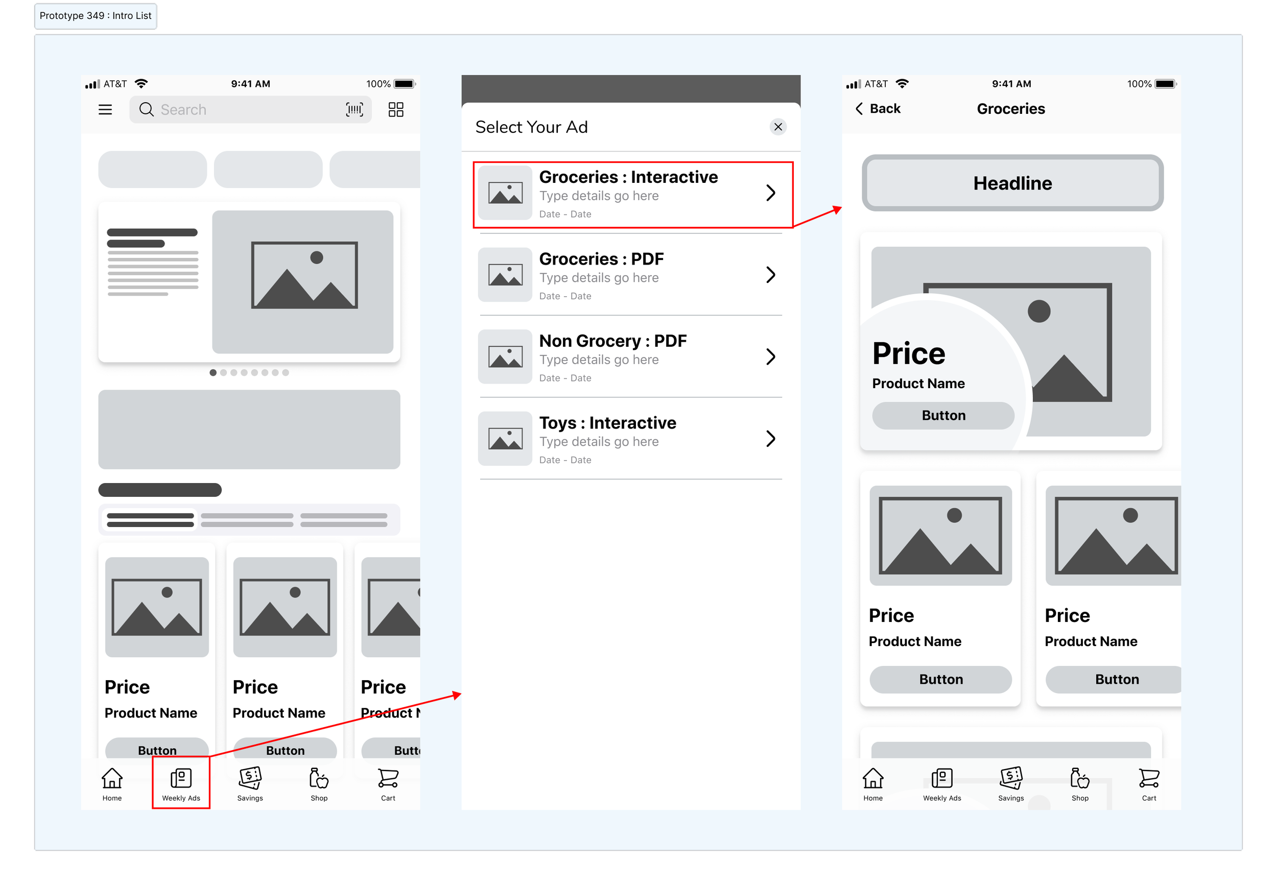
Concept A : Discoverability First
After using all four concepts, 100 users 44% said they preferred Concept A.
Strengths
Creates maximum visibility into the available Weekly Ad experiences, helping customers quickly understand that multiple ad formats and shopping experiences are available.
Establishes a strong foundation for discoverability as additional ad experiences are introduced over time.
Tradeoffs
Requires an explicit selection before entering the Weekly Ad, introducing additional friction for returning customers and slowing access to their preferred shopping experience.
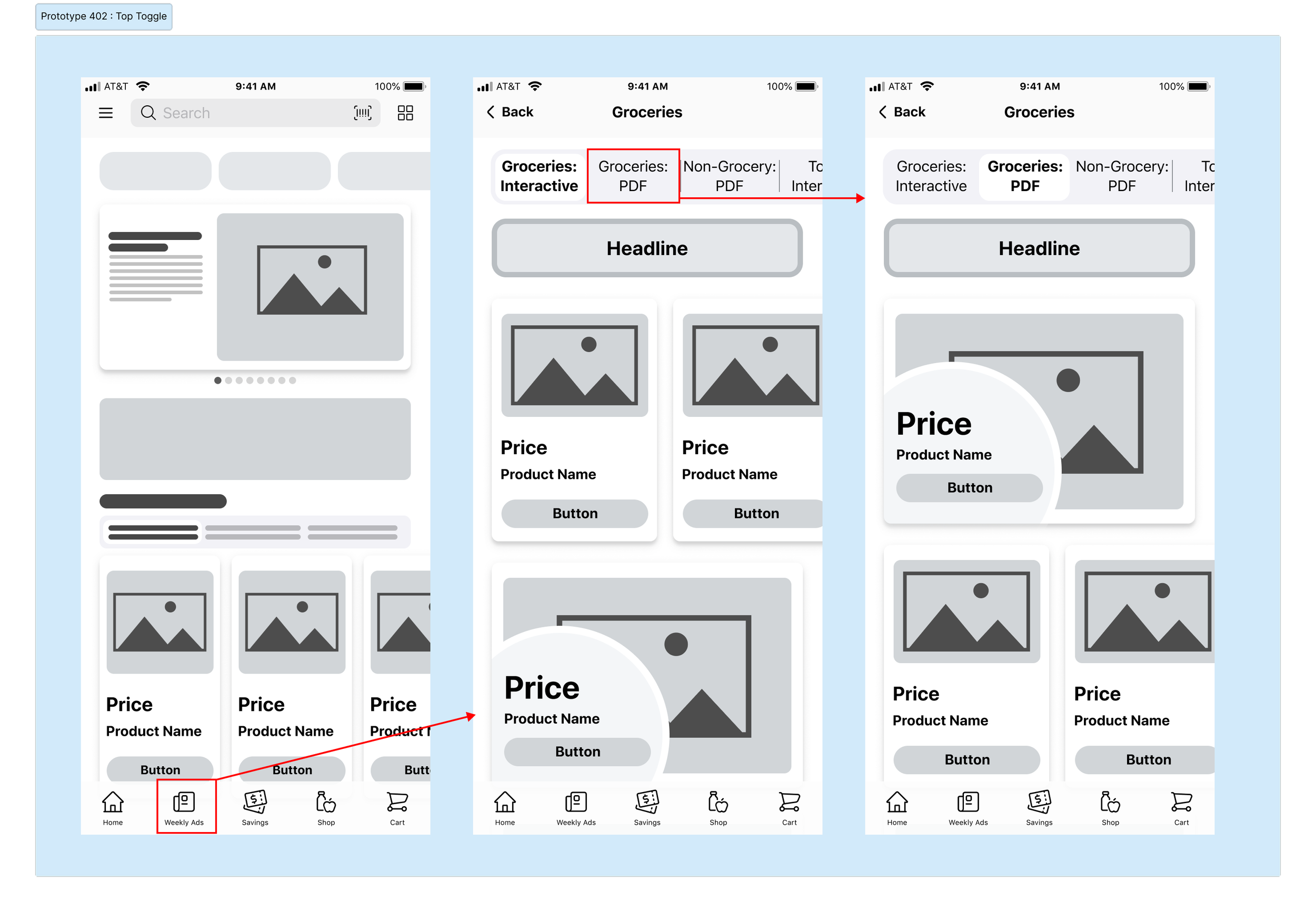
Concept B : Efficient Ad Switching
After using all four concepts, 100 users 34% said they preferred Concept B.
Strengths
Prioritizes efficiency by making it easy for customers to switch between Weekly Ad experiences at any point during their shopping journey.
Reduces friction for customers who frequently compare multiple ad experiences, supporting quick, repeat interactions.
Tradeoffs
Competing priorities within a limited horizontal space reduced our ability to clearly label and differentiate ad experiences.
The design became increasingly constrained with larger accessibility text sizes and a growing number of available ads, raising concerns about both readability and scalability.
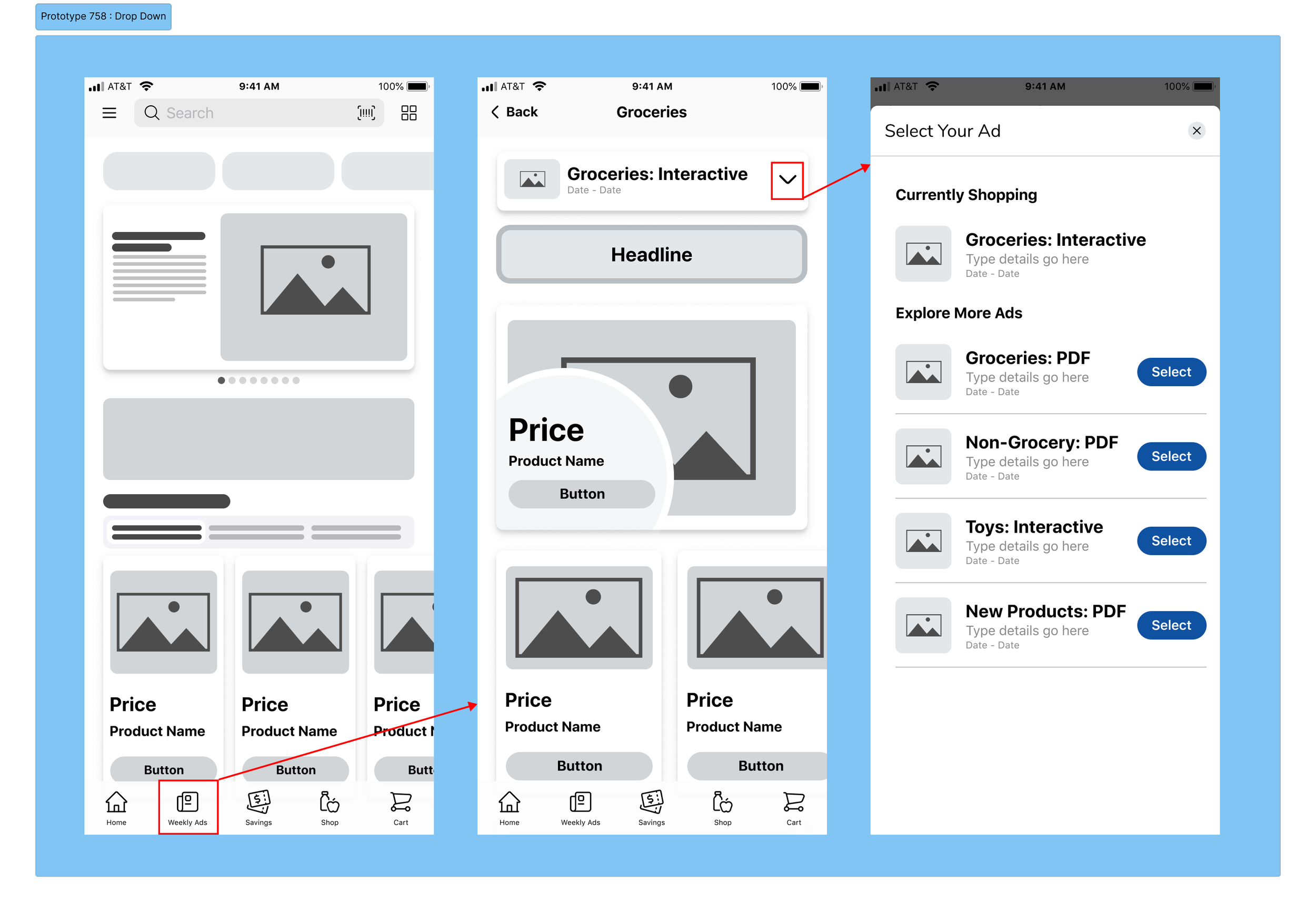
Concept C : Scalable Navigation
After using all four concepts, 100 users 14% said they preferred Concept C.
Strengths
Creates a clear moment of orientation, helping customers understand which Weekly Ad they're currently viewing while presenting all available options in a structured, easy-to-scan format.
Establishes a scalable interaction model that can gracefully accommodate a growing portfolio of Weekly Ad experiences without increasing visual complexity.
Translates consistently across iOS, Android, and Web, making it the simplest concept to implement and maintain across platforms.
Tradeoffs
If the entry point remains fixed at the top of the page, customers who frequently switch between ads must scroll back to access it, introducing friction for repeat interactions.
Making the entry point persistent improves accessibility but competes for valuable screen real estate, particularly on smaller mobile devices where content visibility is limited.
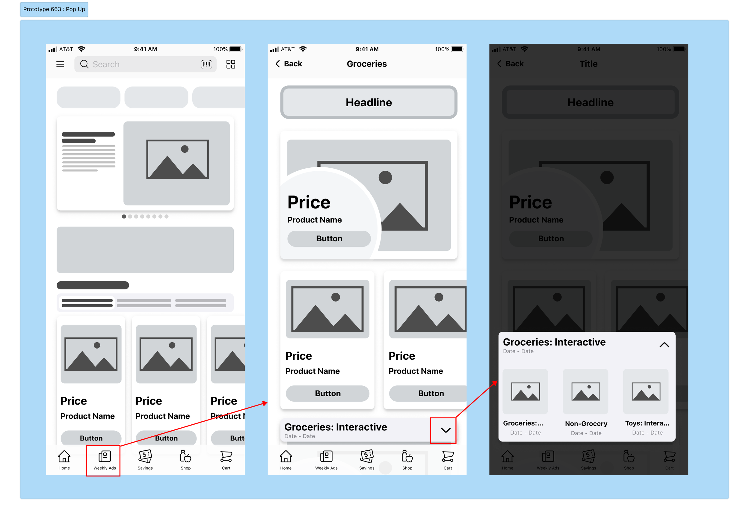
Concept D : Contextual Selection
After using all four concepts, 100 users 8% said they preferred Concept D.
Strengths
Prioritizes a clean browsing experience by keeping ad selection separate from the primary shopping flow.
Minimizes initial page complexity while allowing customers to intentionally explore alternative ad experiences.
Supports efficient loading of content by displaying ad options only when needed.
Tradeoffs
Introduces a more technically complex interaction pattern due to the use of a drawer across multiple platforms.
As the product portfolio expands, the drawer becomes less effective at organizing and presenting a growing number of ad experiences, limiting its long-term scalability.
What We Learned
Rather than searching for a single "best" concept, this exercise helped us understand the tradeoffs between discoverability, efficiency, scalability, and implementation complexity. User testing identified the strongest interaction model from a customer perspective, while conversations with Engineering helped us understand the technical implications of each approach. The final solution combined the strongest elements of multiple concepts to balance customer needs, business goals, and platform constraints.
From Concept to Final Design
By this stage, user testing had given us valuable insight into how customers preferred to navigate between ad experiences—but the decision wasn't as simple as selecting the highest-performing concept.
The final design wasn't simply the concept that tested best—it was the result of balancing user research, engineering constraints, accessibility, scalability, and business goals.
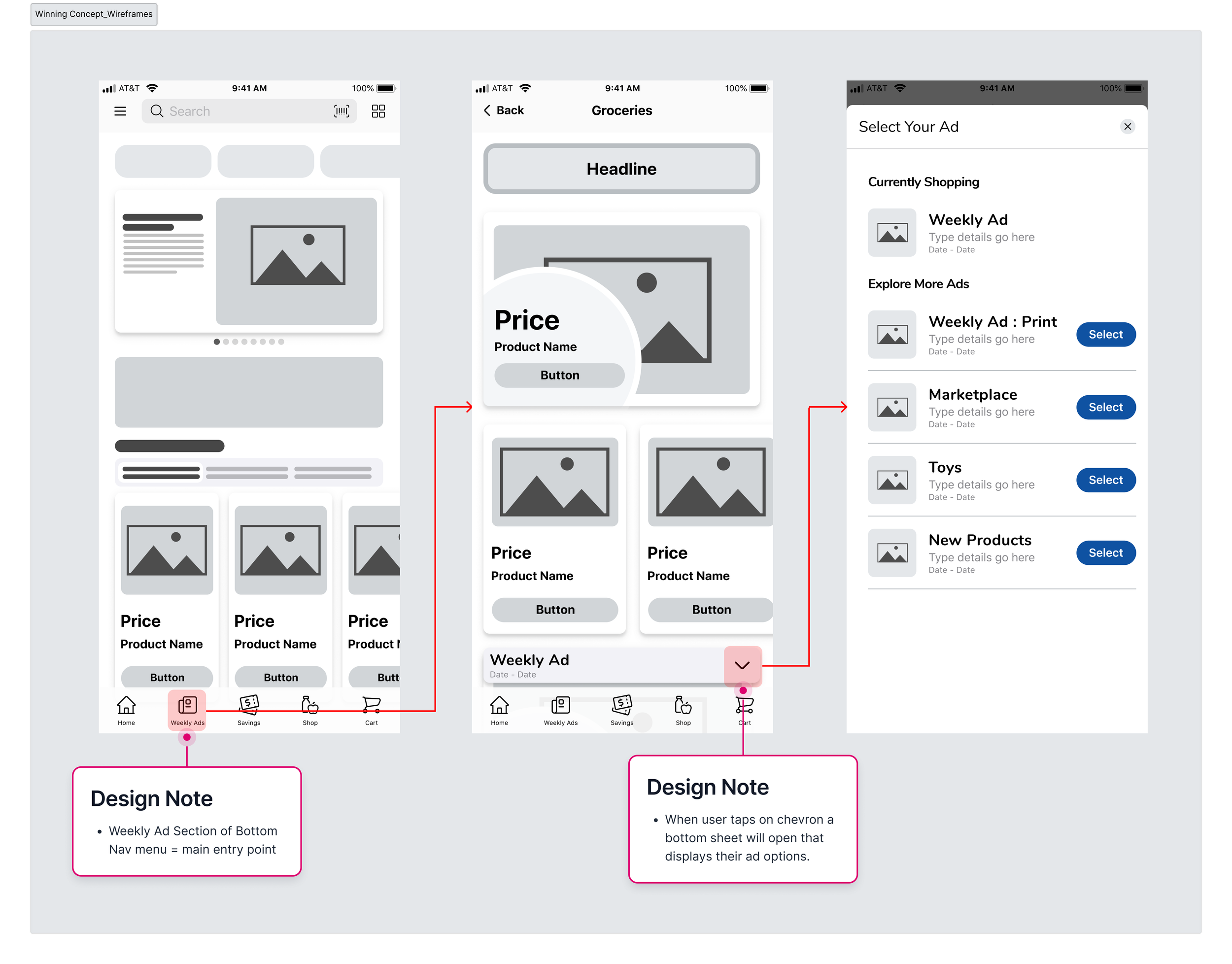
✔ Discoverable
✔ Efficient
✔ Scalable
✔ Technically feasible
✔ Accessible
Learning from Live Behavior
Observation → Hypothesis → Experiment → Outcome
➡️ Launching the Ad Selector wasn't the end of the project—it marked the beginning of our next learning cycle. ⬅️
Observation
Shortly after launch, we noticed engagement with the Ad Selector was lower than anticipated. While the feature was available to all users, relatively few were interacting with it.
Before proposing a design change, I revisited our usability findings to validate whether the issue stemmed from the interaction itself. The research remained consistent: participants found the Ad Selector intuitive and had little difficulty discovering or using it during testing.
The disconnect between usability testing and live behavior suggested we weren't looking at a usability problem—we were looking at a discoverability problem.
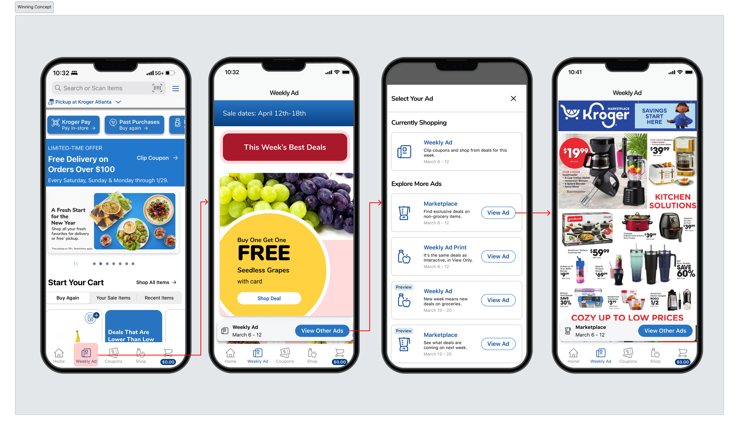
While Concept A performed best in usability testing, it also introduced additional friction by requiring customers to make an ad selection every time they entered the Weekly Ad. Other concepts solved for efficiency or discoverability but introduced tradeoffs around technical complexity or long-term scalability.
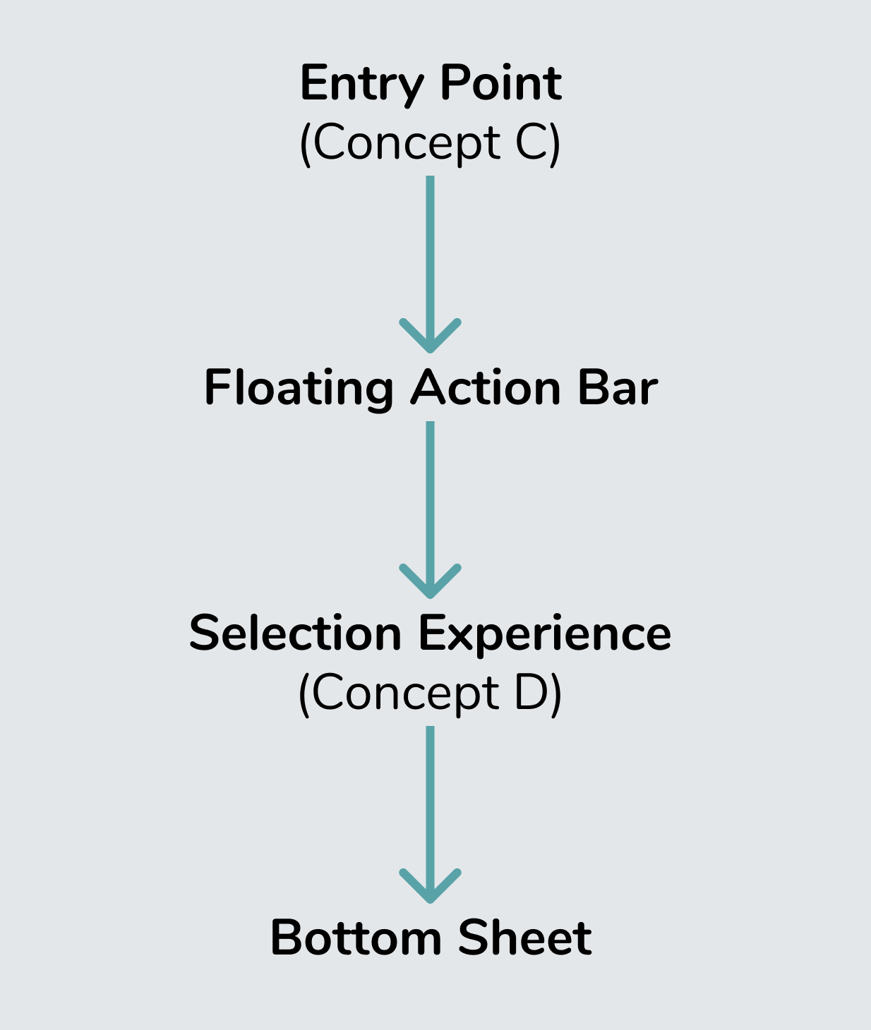
Rather than selecting a single concept, I broke the experience into the two distinct interactions we were actually designing:
How customers discover and enter the Ad Selector
How customers browse and choose from the available ad experiences
Viewing the journey this way allowed us to optimize each interaction independently.
For the entry point, we adopted the persistent floating action bar from Concept C, creating a lightweight, discoverable entry that remained accessible without interrupting the shopping experience.
For the selection experience, we paired it with the bottom sheet from Concept D, providing customers with a clear, organized view of every available Weekly Ad while creating a scalable foundation that could support future ad formats and an expanding product portfolio.
The final solution wasn't a compromise between concepts—it was a synthesis of their strongest qualities, resulting in an experience that balanced customer needs, technical feasibility, and long-term product strategy.
Why This Worked
Hypothesis
Comparing launch data with historical engagement between Weekly Ad experiences, we developed a new hypothesis:
Customers weren't intentionally looking for multiple ad experiences, so many never noticed the new capability existed.
The challenge wasn't helping users understand the Ad Selector once they found it—it was helping them discover that it was there in the first place.
Experiment
Rather than redesigning the feature, we looked for the smallest intervention that could validate our hypothesis.
We chose to introduce a dismissible coach mark using an existing design pattern already established elsewhere in the Kroger experience. Reusing a familiar component allowed us to move quickly while maintaining consistency across the product.
Instead of investing in a lengthy A/B test, we launched the enhancement in a smaller market. This approach required a similar level of implementation effort while allowing us to observe real customer behavior in a live environment before expanding to additional markets.
This was an important reminder that an experience can be highly usable once discovered, yet still fail if customers never notice it exists.
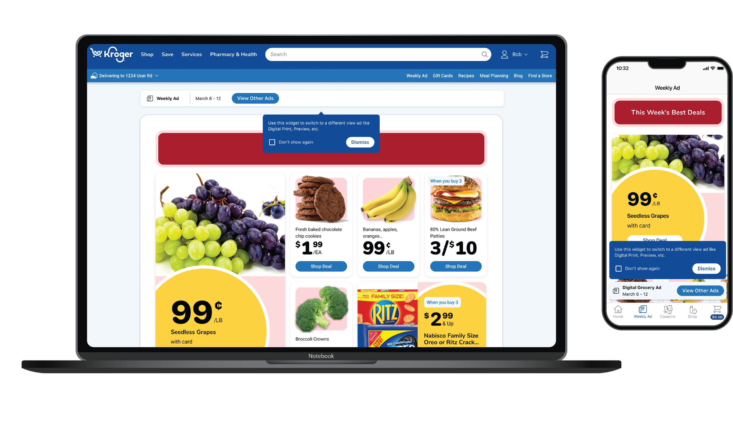
15% → 34%
Engagement with the Ad Selector pre Coach Mark then post Coach mark
Reflections
This project reinforced that solving navigation and discoverability challenges isn't just about helping users find content—it's about creating systems that scale across evolving business needs, technical constraints, and customer expectations. By grounding decisions in research, testing, and cross-functional collaboration, we were able to deliver a solution that balanced immediate usability with long-term flexibility.